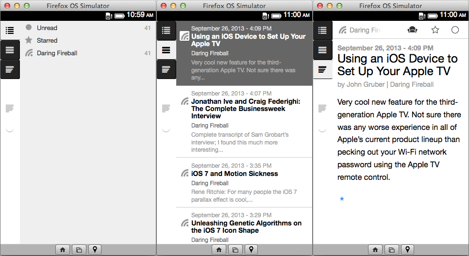
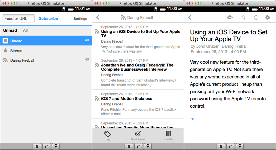
On August 26th, I posted several feature requests for Feedbin. On August 27th, Feedbin became open source1. Since the timing was just too perfect to ignore, I decided to fix some things myself. The first big improvement has been fixing Feedbin's mobile interface2, which previously looked like this:

And now looks like this:

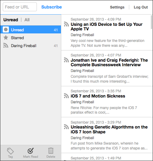
All I really did was make the main interface usable on smaller screens. The big advantage is that all of the features of the main interface are available on small screens now, including the ability to subscribe to feeds and access the settings (although making the settings nice on mobile is still a work in progress3). Also, the design changes when the screen gets too small, but there's no "one true mobile interface". For example, if the screen is 500 px width, there's not space to show all three columns, but we can easily fit the feed column and the entries column:

I already had a general idea of how to use CSS4 for responsive pages5, but I hadn't done it on this scale before. Since I learned a lot while doing this, I thought it might be useful to describe what I did for other people to learn from too.
Mozilla Developer Network
I used MDN6 constantly while I was working on this. If you need to know anything about CSS or HTML, MDN is the place to look. And this isn't just for Firefox developers. At the bottom of every page, MDN has a "Browser compatibility" section, which will let you know if and when a feature was introduced in Chrome, Firefox, Internet Explorer, Opera and Safari (and some pages cover features which aren't even supported in Firefox). Luckily, MDN is well supported by search engines, so if you want to know about something like the width property, do a search for mdn width. If you use DuckDuckGo, you don't even need to do that, since it gets information from MDN by default7.
max-width and min-width
The easiest way to make a page scale is by replacing the CSS width property8 with max-width9 and min-width10 where appropriate. On a lot of pages, width is used to prevent the content from becoming too wide, to keep lines of text at a reasonable length11. In cases like that, just replace width with max-width, and the content will be capped at that size, but it will also be able to scale down if the screen is smaller. When you do that, sometimes the page can scale small enough that things start to break. If that happens, use min-width to prevent the content from going below a certain size. I use this mainly for menus, because I don't want them to become too large (max-width), but when the page gets really small, I don't want the layout to break (min-width). Block elements will usually expand to fill any empty space, so max-width is good enough, but for inline elements, you may also need to set a width to force the element to expand, like so:
.inline-scalable-thing {
    /* attempt to be 300px wide, but never take up more than 100% of the
     * available width */
    /* note that you'll need workarounds if your element also has margins
     * or padding */
    max-width: 300px;
    width: 100%;
}
max-width is a lot more useful than min-width (I just checked the CSS, and we're not using min-width at all in Feedbin), but it's useful to know that they both exist.
Media Queries
Media queries12 are the other major tool in the responsive design toolbox. They let you tell the page to lay things out differently based on the screen size (and other rules). For example, in Feedbin, I wanted the feed entry content tab to go away when the page got too small, and then for the feed entry list to go away when it gets smaller than that. The actual CSS is pretty complicated, but the basic version is something like this:
@media(max-width: 768px) {
    .entry-column {
        display: none;
    }
}
@media(max-width: 420px) {
    .entries-column {
        display: none;
    }
}
All this means is, "if the page is smaller than 768 px, don't show the entry column, and if the page is smaller than 420 px, don't show the entries column". Of course, when someone chooses a feed, we want to display those entries, and when someone picks an entry, we want to show the entries content. The trick to that was to add a CSS class based on which state we are in (nothing-selected, feed-selected, entry-selected), and then make the CSS rules include that too, leaving us with something like:
@media(max-width: 768px) {
    .nothing-selected .entry-column,
    .feed-selected .feeds-column {
        display: none;
    }
}
@media(max-width: 420px) {
    .nothing-selected .entries-column,
    .nothing-selected .entry-column,
    .feed-selected .feeds-column,
    .feed-selected .entry-column,
    .entry-selected .feeds-column,
    .entry-selected .entries-column {
        display: none;
    }
}
The actual CSS is more complicated, because the minimum usable sizes for each column are different, but in principle, this is all it took.
Tables
I didn't actually add any tables or position: absolute properties, but I did find out why they were being used. It's actually extremely difficult to get a multi-column layout to scale properly without using tables. In some cases, you can get the desired effect by using percent sizes:
div.left-column {
    width: 20%;
}
div.right-column {
    width: 80%;
}
But, CSS's stupid, stupid box model13 means that this is almost impossible to get right without additional non-semantic wrappers. For example, if you want to add padding to those columns:
div.left-column {
    padding-right: 10px;
    width: 20%;
}
div.right-column {
    padding-left: 10px;
    width: 80%;
}
Congratulations, your layout is now broken, because instead of interpreting this in a sane way, like "Make the width 20%, add 10 px of padding inside", the browser interprets this as, "Make the width 20% + 10 px, and add 10 px of padding inside". Attempting to use margin or border will have the same effect.
Luckily, if you don't mind CSS snobs looking down on you, there's always tables:
td.left-column {
    width: 20%;
    padding-right: 10px;
}
td.right-column {
    padding-right: 10px;
}
In this example, td.left-column's actual width will be 20% + 10 px, and td.right-column's width will be "whatever is left", which is generally close enough to what you actually wanted.
In some cases, you can use CSS to turn non-tables into tables, using display: table and display: table-cell14. Unfortunately, to make that work you still need a non-semantic wrapper to turn into a table, so I don't see much advantage to using that instead of just making your HTML contain a table. The other problem is that there's no way to set the colspan or rowspan in CSS (there are proposals, but it's not supported by Firefox), which means certain kinds of layouts can't be controlled with CSS.
Other People
Of course, a big part of getting this done was not needing to do anything except CSS and basic CoffeeScript and Ruby. Ben Ubois15 did all of the things I wasn't interested in, like actually thinking about the design and getting me icons to work with. Making a project open source is already a big deal, but Ben went beyond the "just making it available"16 part of open source, and actively helped me participate. If you've been wanting to get into open source, Feedbin is a good project to consider, and there's a long list of features to work on17 if you're interested (some of which18 sound pretty easy).
http://blog.feedbin.me/2013/08/27/feedbin-is-open-source/ - "Feedbin is Open Source"
https://twitter.com/feedbin/status/382200745774170112
https://github.com/feedbin/feedbin/pull/36 - "Mobilize settings page by brendanlong · Pull Request #36 · feedbin/feedbin · GitHub"
https://www.brendanlong.com/responsive-design.html - "Responsive design"
https://www.brendanlong.com/better-responsive-design.html - "Better responsive design"
https://developer.mozilla.org/ - "MDN Web Docs"
https://duckduckgo.com/?q=max-width - "max-width at DuckDuckGo"
https://developer.mozilla.org/docs/Web/CSS/width - "width - CSS | MDN"
https://developer.mozilla.org/docs/Web/CSS/max-width - "max-width - CSS | MDN"
https://developer.mozilla.org/docs/Web/CSS/min-width - "min-width - CSS | MDN"
http://practicaltypography.com/line-length.html - "Line length | Butterick’s Practical Typography"
https://developer.mozilla.org/docs/Web/Guide/CSS/Media_queries - "Using media queries - CSS | MDN"
https://developer.mozilla.org/docs/Web/CSS/box_model - "Introduction to the CSS box model - CSS | MDN"
https://developer.mozilla.org/docs/Web/CSS/display - "display - CSS | MDN"
http://benubois.com/ - "Ben Ubois"
https://en.wikipedia.org/wiki/Android_%28operating_system%29 - "Wikipedia: Android (operating system)"
https://github.com/feedbin/support/issues - "GitHub · Where software is built"
https://github.com/feedbin/support/issues/361 - "Feature Request: Minimal Second Pane View · Issue #361 · feedbin/support · GitHub"